Tutorial 7 - Exploratory data analysis
23 April 2011
Data analysis begins with quality control and familiarizing oneself with the collected data. Enormous effort and resourses are invested in designing and collecting data. It is therefore vital that some time and effort should also be invested in checking that the data were transcribed correctly.
Most good research programs will have fully considered the eventual analysis options when designing the surveys or experiments. Nevertheless, real observed ecological data rarely complies exactly with the requirements of all analysis procedures. Ecological pursuits are often plagued by missing or peculiar observations, spurious measurements and unexpected trends. Hence it is also vital that the researcher be aware of any issues in their data so that they can best accommodate them in the statistical models.
The reliability of most statistical analyses is dependent on the degree to which the data (or residuals) conform to specific conditions. For example, traditional linear regression assumes that the residuals are normally distributed and homogeneous the relationship between the response and predictor is linear.
Whilst these conditions are most definitively assessed after the model has been fitted, major violations can be pre-identified from a series of simple numerical and graphical summaries. Moreover, many other analogical decisions (such as choice of analysis type, error structure and the makeup of the linear predictor - set of predictor variables) can be sensibly pre-informed once a detailed exploration of the data have been carried out.
In general, decisions made from graphical summaries are more subjective than those based on numerical summaries, however when combined, numerical and graphical summaries can provide a rich set of decision tools.
In order to illustrate exploratory data analysis techniques, I will generate artificial data. This has the advantage of allowing us to match features simple summaries to the 'real' features and parameters of the data.
Numerical summaries
- Factor A has two levels ("a1" and "a2") and 20 replicates of each for a total sample size of 40
- The continuous covariate (X) is drawn from a uniform distribution with a minimum of 20 and maximum of 50
- In the linear predictor model matrix, X is approximately centered (such that the intercept is vaguely informative).
- The intercept is 30 (value of the response when the centered covariate is zero).
- The slope of the relationship between Y and X at level a1 is 2
- Level a2 is five units higher than a1 at centered X
- The slope of the relationship between Y and X at a2 is 2 units less than it is at a1
- The noise (errors) are normally distributed with a mean of 0 and a standard deviation of 5
> set.seed(1)
> n.A <- 3
> n.Rep <- 18
> n <- n.A * n.Rep
> A <- as.factor(c(rep("High", n.Rep), rep("Medium", n.Rep), rep("Low", n.Rep)))
> n.B <- 2
> B <- gl(n = n.B, k = n.Rep/n.B, length = n, lab = paste("b", 1:2, sep = ""))
> X <- runif(n, 20, 50)
> Xmat <- model.matrix(~A * B * I(X - 35))
>
> # Effects
> base <- 30
> X.slope <- 2
> A.eff <- c(5, 2)
> AX.eff <- c(-2, 1)
> B.eff <- 1
> BX.eff <- -1
> AB.eff <- c(2, 3)
> ABX.eff <- c(0.5, 1)
> all.eff <- c(base, A.eff, B.eff, X.slope, AB.eff, AX.eff, BX.eff, ABX.eff)
>
> sigma <- 5
> eps <- rnorm(n, 0, sigma)
> Y <- as.numeric(Xmat %*% all.eff + eps)
> data1 <- data.frame(Y, A, B, X)
> rem <- round(runif(3, 0, n), 0)
> data2 <- data1[-rem, ]
> data2[10, 1] <- NA
> data2[2, 1] <- data2[2, 1] * 100
>
> # save data
> write.table(data1, file = "../downloads/data/data1.csv", quote = FALSE, row.names = FALSE, sep = ",")
> write.table(data2, file = "../downloads/data/data2.csv", quote = FALSE, row.names = FALSE, sep = ",")
Data structure
A broad summary of scale and type of each variable is a very good starting point for exploratory data analysis. Not only can the researcher get a reasonable sense of the data, they can also confirm that R's internal representation of the data is consistent with that of the researcher. For example, does R correctly identify categorical variables as factors and is the order of factor levels compatible with the researchers expectations.
summary()
> summary(data2)
       Y               A       B            X
 Min.   : -17.4   High  :18   b1:25   Min.   :20.4
 1st Qu.:  27.4   Low   :16   b2:26   1st Qu.:30.7
 Median :  36.0   Medium:17           Median :36.6
 Mean   :  74.9                       Mean   :36.1
 3rd Qu.:  42.3                       3rd Qu.:43.2
 Max.   :1993.7                       Max.   :49.8
 NA's   :1
> dim(data2)
[1] 51 4
Close inspection of the above summaries would have revealed:
- The variable Y is a continuous, numeric variable with a single missing value
- There is one very large Y observation that is two orders of magnitude larger than most of the other observations in that variable - possibly a typo or instrument miss-reading/malfunction.
- Variable A is categorical with levels 'High','Low' and 'Medium' - this might not be a logical order for the factor levels.
- There are an unequal number of replicates in Variable A.
- Variable B is a categorical variable with levels 'b1' and 'b2' and unequal numbers of replicates.
- Variable X is a continuous, numeric variable. The quantiles of this variable are very symmetrical suggesting that the data may well be normally distributed.
replications()
Design balance (equal amounts of replicates) is important for many analyses involving multiple categorical variables.
> replications(Y ~ A * B, data1)
  A   B A:B
 18  27   9
> replications(Y ~ A * B, data2)
$A
A
  High    Low Medium
    17     16     17

$B
[1] 25

$`A:B`
        B
A        b1 b2
  High    9  8
  Low     8  8
  Medium  8  9
Close inspection of the above summaries would have revealed:
- Data1 is balanced, there are 9 replicates of each AB combination. The returned object is a vector.
- Data2 is not balanced as there are not the same number of replicates in each AB combination. The returned object is a list.
- Design balance can be assessed by whether the replications() function returns a vector (balanced) or list (unbalanced).
Vector (variable) basic statistical summaries
| Function | Description | Example |
|---|---|---|
| mean() | Arithmetic mean |
> mean(data1$Y, na.rm = TRUE) [1] 34.35 |
| median() | Middle value |
> median(data1$Y, na.rm = TRUE) [1] 35.41 |
| var() | Variance |
> var(data1$Y, na.rm = TRUE) [1] 311.3 |
| sd() | Standard deviation |
> sd(data1$Y, na.rm = TRUE) [1] 17.64 |
| range() | Minimum to maximum |
> range(data1$Y, na.rm = TRUE) [1] -17.44 79.17 |
| quantile() | Quantiles |
> quantile(data1$Y, na.rm = TRUE) 0% 25% 50% 75% 100% -17.44 26.16 35.41 40.47 79.17 |
| fivenum() | Minimum, quantiles and maximum |
> fivenum(data1$Y, na.rm = TRUE) [1] -17.44 25.98 35.41 40.48 79.17 |
| cor() | Correlation between continuous variables |
> cor(data1$Y, data1$X) [1] 0.7644 |
| acf() | Autocorrelation |
> acf(data1$Y, plot = FALSE, lag.max = 5)
Autocorrelations of series 'data1$Y', by lag

     0      1      2      3      4      5
 1.000 -0.030 -0.104  0.211 -0.208 -0.177
|
| length() | Number of items in the vector |
> length(data1$Y) [1] 54 |
| class() | R representation of the object |
> class(data1$Y) [1] "numeric" |
Pivot tables
So called pivot tables, summarize a single variable (typically a numeric vector) by performing a function (such as mean to different subsets of the data. For example, we could calculate the mean of Y for each level of A, or we could calculate the column means or row totals etc.
There are numerous functions available for generating pivot-like summary and aggregation tables:
| Task | Function | Example |
|---|---|---|
| Mean Y of each combination of A and B | tapply |
> with(data2, tapply(Y, list(A, B), mean, na.rm = TRUE)) b1 b2 High 254.70 33.83 Low 35.67 36.54 Medium 27.63 42.55 |
| ddply |
> library(plyr)
> ddply(data2, ~A * B, function(x) mean(x$Y, na.rm = TRUE))
A B V1 1 High b1 254.70 2 High b2 33.83 3 Low b1 35.67 4 Low b2 36.54 5 Medium b1 27.63 6 Medium b2 42.55 |
|
| Mean of all numeric variables for each combination of A and B | ddply and colwise |
> library(plyr)
> ddply(data2, ~A * B, function(x) {
+     colwise(mean, is.numeric, na.rm = TRUE)(x)
+ })
A B Y X 1 High b1 254.70 38.18 2 High b2 33.83 34.98 3 Low b1 35.67 37.71 4 Low b2 36.54 35.97 5 Medium b1 27.63 33.59 6 Medium b2 42.55 36.17 |
| Class of variables in data frame | sapply |
> sapply(data2, class) Y A B X "numeric" "factor" "factor" "numeric" |
| colwise |
> library(plyr)
> colwise(class)(data2)
Y A B X 1 numeric factor factor numeric |
Graphical summaries
Although numerical summaries can provide broad overviews of the data, they can be a gross oversimplification. Notably, point estimates of location and spread tend conceal most of the data and do not provide a full sense of the distribution of the data. Similarly, measures of correlation provide only a single, very narrow perspective of the trend between variables.
Graphical summaries by contrast provide a way to visualize data and trends and thus have the potential to be more useful in informing analytical decisions as well as in identifying and diagnosing possible analysis issues.
Exploring distributions
Histograms
Histograms are useful at representing the distribution of observations for large ($n>30$) sample sizes.
| Normal data with a mean of 10 and standard deviation of 2 | Skewed distribution with a mean of log(10) and standard deviation of log(2) |
|---|---|
> set.seed(1) > VAR <- rnorm(100, 10, 2) > hist(VAR)  |
> set.seed(1) > VAR <- rlnorm(100, log(10), log(2)) > hist(VAR)  |
|
|
The number or size of the bins can be controlled by passing respectively a single number or vector of bin breakpoints with the breaks= argument. It is also possible to pass a function that computes the number of breaks or the name of a breaking algorithm. Specifying the probability=T argument will express the number counts in each bin as a density (probability) rather than as a frequency.
> set.seed(1) > VAR <- rnorm(100, 10, 2) > hist(VAR, breaks = 18, probability = T) > # or equivalently > hist(VAR, breaks = seq(5.5, 15, by = 0.5), probability = T) |
 |
Density
Probability density functions are also useful additions or alternatives to histograms as they further assist in describing the patterns of the underlying distribution. Typical kernel density functions fit a series of kernels (symmetric probability functions) to successive subsets (windows) of the ordered dataset from which new estimates of the observations are calculated. The resolution and texture (smoothness) of the density function is controlled by a smoothing parameter which essentially defines the width of the kernel window.make
A density function can be plotted using the density() function
as an argument to the high-level overloaded
plot() function.
> set.seed(1) > VAR <- rnorm(100, 10, 2) > plot(density(VAR)) |
 |
|
The type of smoothing kernel (normal or gaussian by default) can be defined by the kernel= argument and the degree of smoothing is controlled by the bw= (bandwidth) argument. The higher the smoothing bandwidth, the greater the degree of smoothing. > set.seed(1) > VAR <- rnorm(100, 10, 2) > plot(density(VAR, bw = 1)) |
 |
|
The density function can also be added to a histogram using the density() function as an argument to a the low-level lines() function. > set.seed(1) > VAR1 <- rlnorm(100, log(10), log(2)) > hist(VAR1, prob = T) > lines(density(VAR1)) |
 |
Q-Q plots
Q-Q normal plots can also be useful at diagnosing departures from normality by comparing the data quantiles to those of a standard normal distribution. Substantial deviations from linearity, indicate departures from normality. Quantiles are a regular spacing of points throughout an ordered data set.
| Normal distribution | Log-normal distribution |
|---|---|
> qqnorm(VAR) > qqline(VAR)  |
> qqnorm(VAR1) > qqline(VAR1)  |
|
|
Boxplots
For smaller sample sizes, histograms and density functions can be difficult to interpret. Boxplots (or box-and-whisker plots) provide an alternative means of depicting the location (average), variability and shape of the distribution of data. The dimensions of a boxplot are defined by the five-number summaries (minimum value, lower quartile (Q1), median (Q2), upper quartile (Q3) and maximum value - each representing %25%) of the data.

Univariate boxplots are generated by passing a vector to the boxplot() function.
| Normal distribution | Log-normal distribution |
|---|---|
> set.seed(11) > VAR2 <- rnorm(15, 10, 2) > boxplot(VAR2)  |
> set.seed(11) > VAR3 <- rlnorm(15, log(10), log(2)) > boxplot(VAR3)  |
|
|
The horizontal=T argument is used to produce horizontally aligned boxplots.
> boxplot(VAR3, horizontal = TRUE) |
 |
Conditional boxplots
When a categorical predictor has more than three levels patterns of variance are more readily explored with boxplots. Rather than a single boxplot representing all of the observed responses, the data are split up (conditioned) according to the levels of a categorical variable.
The height (size) of a boxplot is approximately proportional to the variance of the underlying data and the position of the boxplot along the Y-axis is proportional to the mean. Hence we can explore whether there is likely to be a relationship between population means and variances (which is not desirable) via conditional boxplots.
> set.seed(10)
> A <- gl(n = 5, 10, 50, lab = paste("a", 1:5, sep = ""))
> Xmat <- model.matrix(~A)
> Y <- as.numeric(Xmat %*% c(20, 2, 5, 10, 20))
> Y <- Y + rlnorm(50, log(Y/10), log(Y/10))
> boxplot(Y ~ A)
|
 |
Rug charts
Another representation of the data that can be added to existing plots is a rug chart that displays the values as a series of ticks on the axis. Rug charts can be particularly useful at revealing artifacts (such as clumping) in the data that are "smoothed" over by histograms, boxplots and density functions.
> boxplot(VAR3, horizontal = TRUE) > rug(VAR3, side = 1)  |
> plot(density(VAR1)) > rug(VAR1, side = 1)  |
Exploring relationships
When two or more continuous variables are collected, we often intend to explore the nature of the relationships between the variables. Such trends can be depicted graphically in scatterplots. Scatterplots display a cloud of points, the coordinates of which correspond to the values of the variables that define the horizontal and vertical axes.
Scatterplots
Although scatterplots do not formally distinguish between response (dependent) and predictor (independent) variables, when such distinctions occur, independent variables are conventionally plotted along the horizontal (x) axis.
Scatterplots are used prior to analyses to help assess the suitability of the data to particular analytical procedures. Of particular importance are the insights they provide into the linearity and patterns of variability of trends. They are also presented post analysis as summaries of the trends and analyses.
| Normality, linearity, homogeneity of variance met | Normality, linearity, homogeneity of variance violated |
|---|---|
> set.seed(7) > x <- runif(20, 0, 30) > y <- (2 * x) + 3 + rnorm(20, 0, 5) > plot(y ~ x)  |
> set.seed(7) > x <- runif(20, 0, 30) > y <- 3 * x/(8 + x) + rnorm(20, 0, (0.15 * x/10)) > plot(y ~ x)  |
|
|
Trendline
Fitting a linear line of best fit through the data cloud can diagnose issues with non-linearity and homogeneity of variance. Ideally, the data should be spread evenly about the trendline. Increasing spread along a trendline is symptomatic of a relationship between mean and variance and thus evidence of non-homogeneity.
| Normality, linearity, homogeneity of variance met | Normality, linearity, homogeneity of variance violated |
|---|---|
> set.seed(7) > x <- runif(20, 0, 30) > y <- (2 * x) + 3 + rnorm(20, 0, 5) > plot(y ~ x) > abline(lm(y ~ x), lty = 2)  |
> set.seed(7) > x <- runif(20, 0, 30) > y <- 3 * x/(8 + x) + rnorm(20, 0, (0.15 * x/10)) > plot(y ~ x) > abline(lm(y ~ x), lty = 2)  |
|
|
Lowess smoother
A lowess (locally weighted polynomial regression) smoother generates a curve by stitching together a series of polynomials that each apply to different regions of the data cloud. When a trend is consistently linear throughout its length, each of the smaller polynomial trends (and thus the overall smoother) should be approximately linear. Thus major deviations from linearity can be identified via lowess smoothers that display multiple trajectories (directions).
Analytical decisions regarding the use of scale transformations, non-linear modeling or additive models can be made on the basis of these simple smoothers.
| Normality, linearity, homogeneity of variance met | Normality, linearity, homogeneity of variance violated |
|---|---|
> set.seed(7) > x <- runif(20, 0, 30) > y <- (2 * x) + 3 + rnorm(20, 0, 5) > plot(y ~ x) > lines(lowess(y ~ x), lty = 2)  |
> set.seed(7) > x <- runif(20, 0, 30) > y <- 3 * x/(8 + x) + rnorm(20, 0, (0.15 * x/10)) > plot(y ~ x) > lines(lowess(y ~ x), lty = 2)  |
|
|
Spline smoothers
| Normality, linearity, homogeneity of variance met | Normality, linearity, homogeneity of variance violated |
|---|---|
> set.seed(7) > x <- runif(20, 0, 30) > y <- (2 * x) + 3 + rnorm(20, + 0, 5) > plot(y ~ x) > library(splines) > sm <- lm(y ~ ns(x, k = 3)) > xs <- seq(0, 30, l = 100) > lines(xs, predict(sm, + newdata = data.frame(x = xs)), + lty = 2)  |
> set.seed(7) > x <- runif(20, 0, 30) > y <- 3 * x/(8 + x) + + rnorm(20, 0, (0.15 * + x/10)) > plot(y ~ x) > library(splines) > sm <- lm(y ~ ns(x, k = 3)) > xs <- seq(0, 30, l = 100) > lines(xs, predict(sm, + newdata = data.frame(x = xs)), + lty = 2)  |
Scatterplot
To facilitate all of these diagnostic features as well as marginal boxplots, the high-level scatterplot() function (car package) is very useful. Note, the scatterplot() function fits a lowess rather than loess smoother.
| Normality, linearity, homogeneity of variance met | Normality, linearity, homogeneity of variance violated |
|---|---|
> set.seed(7) > x <- runif(20, 0, 30) > y <- (2 * x) + 3 + rnorm(20, 0, 5) > library(car) > scatterplot(y ~ x)  |
> set.seed(7) > x <- runif(20, 0, 30) > y <- 3 * x/(8 + x) + rnorm(20, 0, (0.15 * x/10)) > library(car) > scatterplot(y ~ x) 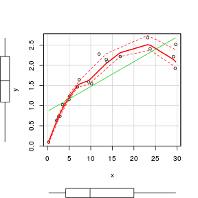 |
Scatterplot matrix
When there are numerous potential predictors we not only need to be concerned about the nature of distributions and relationships with the response variable. Models involving multiple predictor variables are often compromised by the presence of predictors that are correlated to one another.
- Normally distributed response ($y$) with mean of 20 and variance of 5 ($N(\mu=20,\sigma^2=5$)
- Normally distributed predictor1 ($x1$) with mean of 50 and variance of 10 ($N(\mu=50,\sigma^2=10$)
- Normally distributed predictor2 ($x2$) with mean of 100 and variance of 20 ($N(\mu=100,\sigma^2=20$)
- In order to control (approximately fix) the degree of correlation between the three variables, we need to sample from a multivariate normal distribution. The multivariate normal distribution is defined by the variable means and variance-covariance matrix. Since \begin{align*} Corr(x,y) &= Cov(x,y)/\sqrt{Var(x)*Var(y)}\\ Cov(x,y) &= Corr(x,y)*\sqrt{Var(x)*Var(y)} \end{align*} we can use the desired correlations to calculate the covariances between each variable
- Correlation between $Corr(Y,X1)=0.9, Corr(Y,X2)=0.1, Corr(X1,X2)=0.5$
- Use the rmvnorm() function in the mvtnorm package to generate 50 sets of observations from a multivariate normal distribution with the specified means and variance-covariances
> set.seed(3)
> y.mean <- 20
> y.var <- 5
> x1.mean <- 50
> x1.var <- 10
> x2.mean <- 100
> x2.var <- 20
>
> cor.yx1 <- 0.7
> cov.yx1 <- cor.yx1 * sqrt(y.var * x1.var)
>
> cor.yx2 <- -0.6
> cov.yx2 <- cor.yx2 * sqrt(y.var * x2.var)
> cor.x1x2 <- -0.9
> cov.x1x2 <- cor.x1x2 * sqrt(x1.var * x2.var)
> sigma <- matrix(c(y.var, cov.yx1, cov.yx2, cov.yx1, x1.var, cov.x1x2, cov.yx2, cov.x1x2, x2.var), 3,
+     3)
> library(mvtnorm)
> x <- rmvnorm(n = 50, mean = c(y.mean, x1.mean, x2.mean), sigma = sigma)
> data <- data.frame(Y = x[, 1], X1 = x[, 2], X2 = x[, 3])
Scatterplot matrices display a panel of scatterplots between each pair of variables when there are three or more continuous variables. A given variable makes up the x-axis of each of the panels up the column and the y-axis of each of the panels along the row. The diagnal panels are often populated with univariate plots such as boxplots, histograms or density functions. The upper right panels are a mirror of the lower left panels. There are a few high-level plotting functions for producing scatterplot matrices:
- the pairs() function is an extension of the
regular plot()function.
Different functions can be applied to the lower, upper and diagonal panels
of the grid. A lowess smoother is supported by the panel.smooth
function. It is also possible to define alternative functions.
This example illustrates the application of horizontal boxplots into
the diagonal panels. Since, the upper panels are a mirror of the lower
panels, the upper panels can be removed with by setting the
upper.panel= parameter to NULL.
> # define a boxplot panel function
> panel.bxp <- function(x, ...) {
+     usr <- par("usr")
+     on.exit(par(usr))
+     par(usr = c(usr[1:2], 0, 2))
+     boxplot(x, add = TRUE, horizontal = T)
+ }
> pairs(~Y + X1 + X2, data = data, lower.panel = panel.smooth,
+     diag.panel = panel.bxp, upper.panel = NULL, gap = 0)
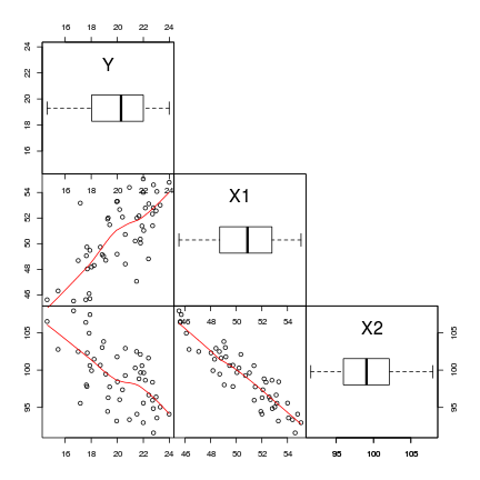
- An increase in X1 appears to be associated with a positive increase in Y
- An increase in X2 appears to be associated with a decline in Y
- X1 and X2 appear to be correlated to one another. This is likely to destabilize any linear models
-
the scatterplotMatrix() function is an extension of the regular scatterplot() function
> library(car)
> scatterplotMatrix(~Y + X1 + X2, data = data, diag = "boxplot")
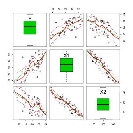
The scatterplotMatrix() function can also differentiate trends for different levels (groups) of a categorical variable. To illustrate, we will use the cut() function to convert the X1 vector into a categorical variable with two levels (small and large).
> library(car)
> scatterplotMatrix(~Y + X2, groups = cut(data$X1, br = 2, lab = c("small",
+     "large")), by.groups = TRUE, data = data, diag = "boxplot")

- The trends between X2 and Y appear to be different for each level of the categorical variable - this would cause problems for the traditional ANCOVA model
- Each level of the categorical variable appears to be associated with a different span of X2 values - this would cause problems for the traditional ANCOVA model
Exploring interactions - means plots
Interactions are outcomes in which the effects of one factor are dependent on the levels of other factor(s). That is, the effect of one factor is not consistent across all levels of the other factors. Interaction plots depict the mean response value of each combination of factor levels (groups) and are therefore useful for interpreting interactions.
Information on the presence of interactions can help inform whether multiplicative models (models with interaction terms) are necessary as well as provide context for interpreting interaction effects.
- Total sample size of 12
- Factor A has 3 levels each with 4 replicates
- Factor B has 2 levels each with 6 replicates
- The mean of the first cell (a1b1) is 20 (this is the base)
- Levels a2 and a3 are 10 and 15 units higher the base
- Level b2 is 5 units lower than the base
- Cell a2b2 is 0 units higher than a2b1
- Cell a3b2 is 10 units lower than a3b1
- The response variable (Y) is equal to the linear predictor (fully factorial, multiplicative model) plus normally distributed errors with mean of 0 and standard deviation of 5
> set.seed(1)
> n.A <- 3
> n.B <- 2
> n.Rep <- 5
> n <- n.A * n.B * n.Rep
> A <- gl(n = n.A, k = n.Rep * n.B, length = n, lab = c("a1", "a2", "a3"))
> B <- gl(n = n.B, k = n.Rep, length = n, lab = c("b1", "b2"))
> # Effects
> base <- 20
> A.eff <- c(10, 15)
> B.eff <- -5
> AB.eff <- c(0, -10)
> all.eff <- c(base, A.eff, B.eff, AB.eff)
>
> sigma <- 5
> eps <- rnorm(n, 0, sigma)
> X <- model.matrix(~A * B)
> Y <- as.numeric(X %*% all.eff + eps)
> data <- data.frame(Y, A, B)
There are a few high-level plotting functions for producing interaction plots matrices:
- the interaction.plot() function
> interaction.plot(data$A, data$B, data$Y, type = "b", pch = 16)

- The effect of factor B (difference between b1 and b2) on Y is not consistent across all levels of factor A and vice verse.
-
the plotmeans() function (gplots() package)
> library(gplots)
> plotmeans(Y ~ interaction(B, A), data = data, connect = list(c(1,
+     3, 5), c(2, 4, 6)))
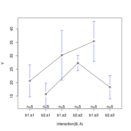
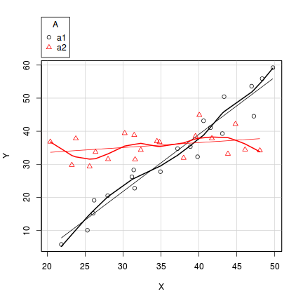
In the case of models containing a mixture of continuous and categorical predictors (ANCOVA), interaction plots can help explore whether the slopes are likely to be homogeneous (ANCOVA models assume that the relationships between response and continuous predictor are very similar for each level of the categorical predictor).
- Factor A has two levels ("a1" and "a2") and 20 replicates of each for a total sample size of 40
- The continuous covariate (X) is drawn from a uniform distribution with a minimum of 20 and maximum of 50
- In the linear predictor model matrix, X is approximately centered (such that the intercept is vaguely informative).
- The intercept is 30 (value of the response when the centered covariate is zero).
- The slope of the relationship between Y and X at level a1 is 2
- Level a2 is five units higher than a1 at centered X
- The slope of the relationship between Y and X at a2 is 2 units less than it is at a1
- The noise (errors) are normally distributed with a mean of 0 and a standard deviation of 5
> set.seed(1)
> n.A <- 2
> n.Rep <- 20
> n <- n.A * n.Rep
> A <- gl(n = n.A, k = n.Rep, length = n, lab = c("a1", "a2"))
> X <- runif(n, 20, 50)
> Xmat <- model.matrix(~A * I(X - 35))
>
> # Effects
> base <- 30
> X.slope <- 2
> A.eff <- c(5)
> AX.eff <- c(-2)
> all.eff <- c(base, A.eff, X.slope, AX.eff)
>
> sigma <- 5
> eps <- rnorm(n, 0, sigma)
> Y <- as.numeric(Xmat %*% all.eff + eps)
> data1 <- data.frame(Y, A, X)
> scatterplot(Y ~ X | A, data = data1)
